After finding the COG-UK data I was looking around for other interesting COVID-19 datasets to play around with and build my R plotting skills with.
User moritz.kraemer posted
this article
on early case descriptions
which included a lot of geo-spacial data that I was interested in takeing a
look at.
There was a significant number of fields devoted to hospitalization related measurements and so I focused on that subject for the plot below.
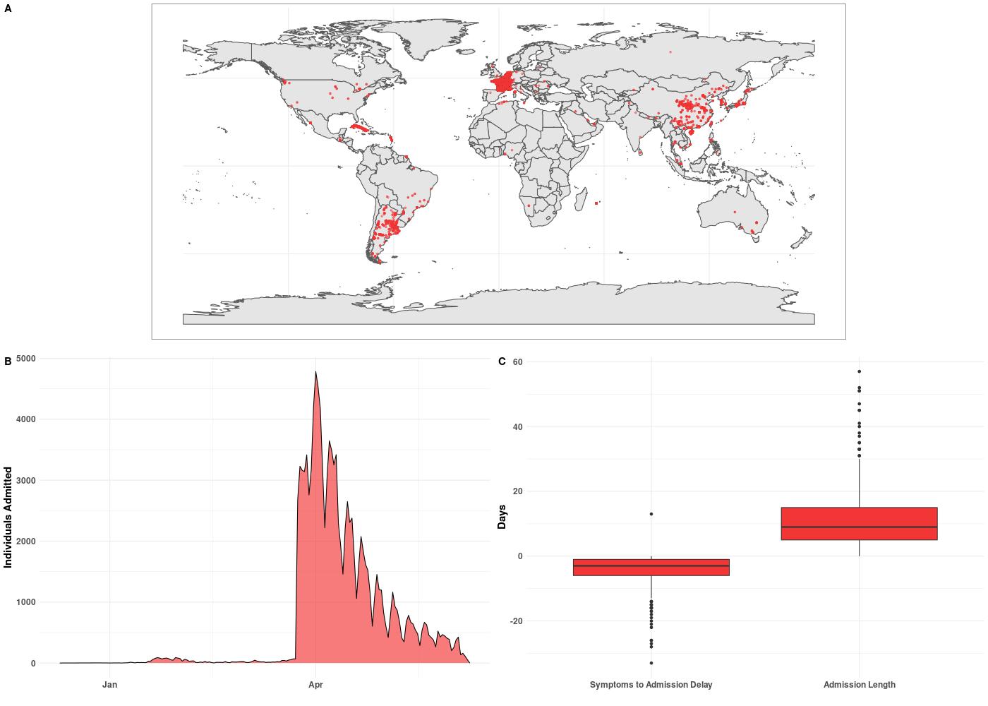
The dataset includes patients with and without hospitalization records and so first I filtered down to just those with records and those who also had location data. This subset of patients formed subplot A. Clearly this is not an exhaustive dataset and seems to focus on hospitalizations for China, France, and Argentina.
Subplot B shows hospitalizations by date, which for this dataset, really pick up in April. However, this is not super informative due to ~90 % of the data being localized to three countries.
Finally, subplot C includes two boxplots. The first shows the difference in days
between a patient experiencing symptoms and admission to a hospital. A negative
value indicates days before admission. So a patient with a value of -10 would
mean the patient experienced symptoms 10 days before being admitted. The second
boxplot shows the length of stay once admitted. It should be noted that this
dataset lumps deaths and discharges into the same category date_death_or_discharge.
The mean stay once admitted was ~10 days.
The R code to generate these plots can be viewed here