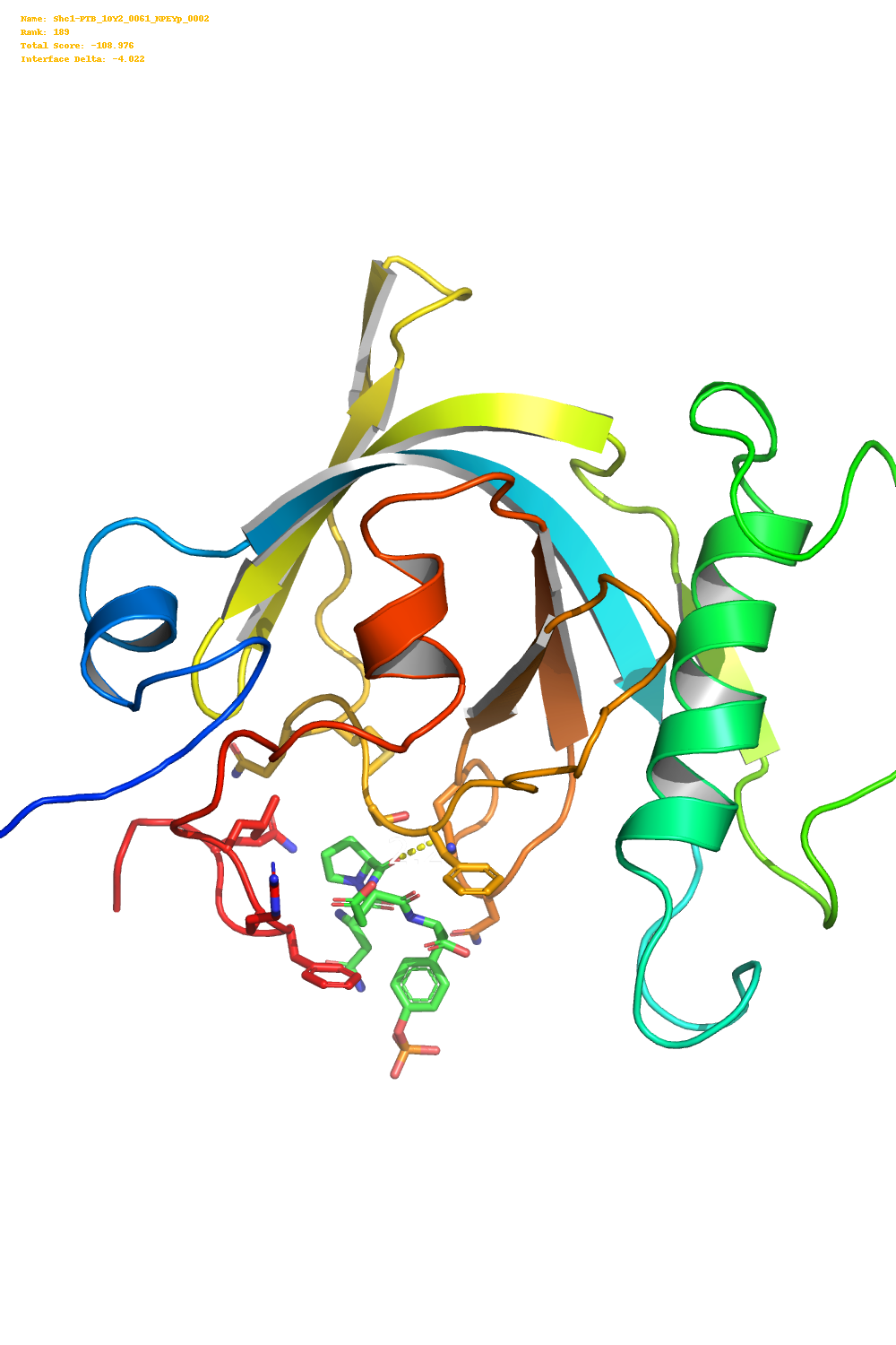
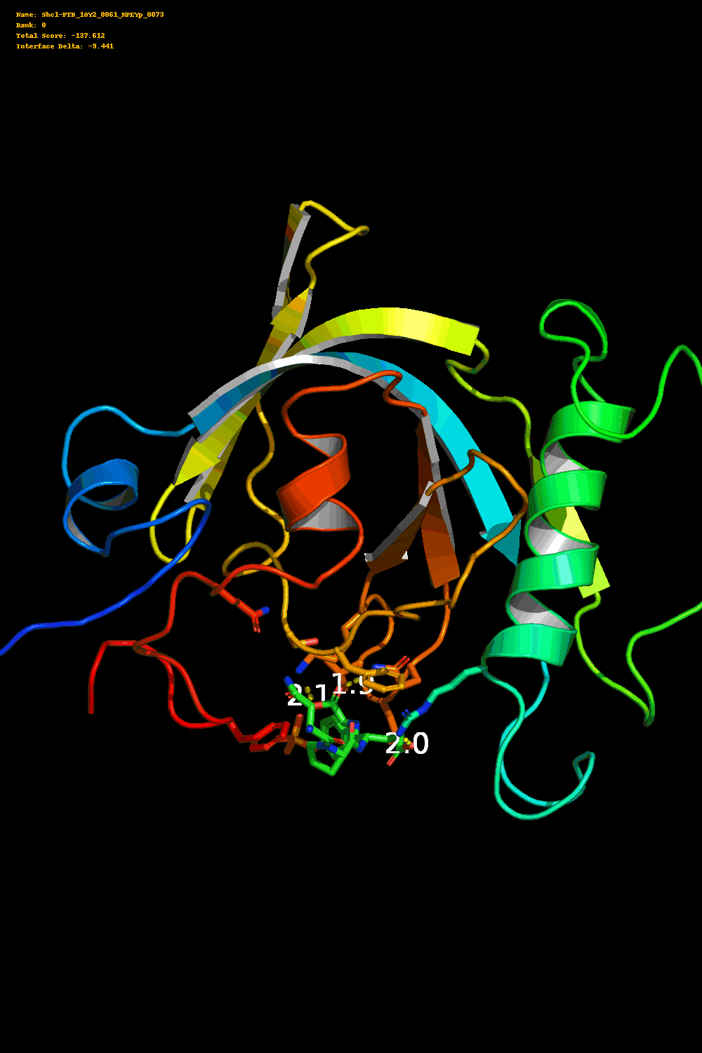
The past couple days I have been running some ligand docking simulations as part of my current rotation with the Cortopasssi lab using Rosetta. One of these docking simulations involved fitting a small portion of the insulin receptor (IR) the lab is interested in, into a known binding region of the Shc1 protein.
Any Rosetta docking simulation will require hundreds of repetitions, which
generate a significant number of pdb files which show the final conformation
of the protein and ligand at the end of a given simulation.
While reading about the best way to aggregate and do analyise on these results I spent a bit of time looking for ways to visualize everything Rosetta spits out.
This was partly to sanity check the results quickly and also because 3D protein structures and plots just tend to look cool.
Individual images using PyMOL
The initial simulation I ran produced 200 pdb files. One approach would be to
create images of the ligand-protein interface for each of these pdb files.
To do this for 200 images I created a very hacky Python script that collects
all the pdb files in a directory then creates a temporary PyMOL script which
takes a nice picture of the ligand-protein interface.
This Python script is basically just a for loop but below is the PyMOL script
that I used. All the {} are filled in using the format function in python
with the correct filepaths for a specific pdb file.
load {}  # load this pdb file

hide everything
set cartoon_fancy_helices = 1
set cartoon_highlight_color = grey70
bg_colour white
set antialias = 1
set ortho = 1
set sphere_mode, 5


select ligand, hetatm
select pocket, ligand around 4
select pocket, byres pocket
distance contacts, ligand, pocket, 4, 2
color 4, contacts

preset.ligand_cartoon('all')
cmd.show('cartoon', 'all')

cmd.delete('docked_pol_conts')
cmd.show('cartoon', 'all')
cmd.hide('lines')
cmd.bg_color('black')
cmd.set('cartoon_fancy_helices', 1)
cmd.show('sticks', 'pocket & (!(n;c,o,h|(n. n&!r. pro)))')
cmd.show('sticks', 'ligand')
cmd.hide('lines', 'hydro')
cmd.hide('sticks', 'hydro')

cmd.center('ligand')

cmd.center('ligand')

ray 1000,1500
png {}  # save the image to this file
quit
This produces image like the one below.
I then used the pillow library along with the score.sc file produced by
Rosetta which has metrics on the docking quality to create a (huge) gif of all these
images.
For some reason I was having an issue where if I changed the font of the text
to anything other than the default font, when converted to a gif the text
would not render. If anyone has had a similar problem please reach out.
Visualizing the ensemble using plotly and R
The second approach I used was to extract the coordinates of the protein and
all ligand conformations from the pdb files and plot them in three dimensions
using plotly. This produces a “cloud” of ligand conformations and is
a more easily accessible sanity check to make sure Rosetta was docking in
generally reasonable locations based on the input parameters.
The atoms are labeled with their identity (either protein or ligand) and their
coordinates. They are colored by the Rosetta total_score parameter for the
complex. Therefore if the complex scored -120, all atoms of the ligand in that
complex will have the color corresponding to the -120 value.
You can pan, zoom, and rotate the plot using the controls in the upper right. The top 100 ligand conformations by total score are shown below.
And the top 100 ligand conformations by interface delta X (difference in stability between bound and unbound states) are below this text.